Blog
December 30,2020
Interior Colors for Winter

It’s wintertime and you want to paint some interior rooms. What colors work best in Winter? Think about the weather. You want to feel warm and cozy. Colors that are normally bright and cheerful may leave people feeling cold. If you need to impress people this season or want to sell the place then you want them to feel comfortable. Here are our picks for the best colors to use in Winter.
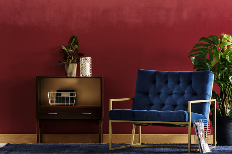
Burgundy
This rich dark red color is reminiscent of cranberries. It really stands out as an accent contrasting with snow-white, while blending in perfectly with the browns and darker greens of autumn.
Gold-Yellow
In the dark days of winter, a little sunshine can go a long way. This is best used as an accent wall to contrast with any darker shade. A burst of sunlight goes a long way, especially when the sky is overcast outside.
Charcoal
A single tone of gray can make a room feel smaller and therefore cozier. Together with soft lighting, a gray wall can be the perfect backdrop for bright colorful accents, while still retaining that cozy feel. Be careful when using dark palettes, too much can be dreary.
Rust
A rusty colored piece of furniture or art, maybe an old metal sign coated in rust can be the perfect accent in an otherwise bright room. A small accent wall can also be used. This brings the winter warmth into an otherwise cold harsh room right when you need it most.
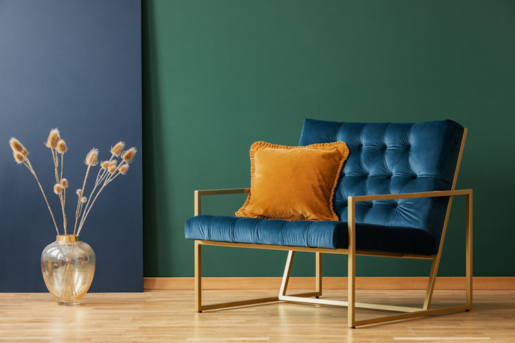
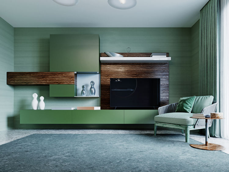
Emerald
This shade of green is dark and intense. It’s absolutely perfect, in limited quantity for use near golds and grays which in combination create a luxurious feel. Nothing better than some luxury in the cold of winter.
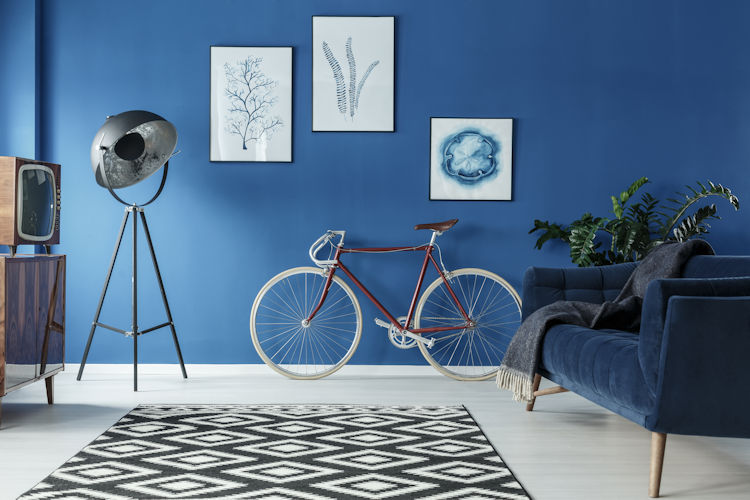
Navy
This dark shade of blue works much like emerald and gray above. Keep it in the background behind your artwork and use it to provide a more inviting feel than black and a more interesting contrast than white.
Pink
Energetic pink can throw some zing into your room. Just keep it to the smaller accents. Use a darker shade of pink, if you can find one and it’s perfect for chasing away those wintertime blues.
Woody Brown
This deeper shade of brown should be used as furniture or cabinetry. Let the natural grains of the wood stand out and provide a warm and inviting place to relax in.
Alabaster
This specific shade of white from Sherwinn-Williams manages to avoid being a sterile white while still looking sufficiently white on any surface or in any light to keep things clean, but not overly bright.
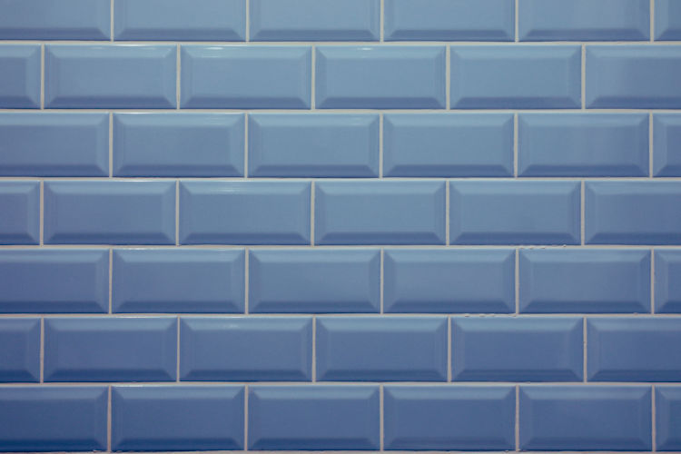
Denim Blue
Denim carries a lot of warmth while acting as a bridge to gray or green. Use it as a subdued accent wall or drapery to keep your dark colors from being too dark and your lights from being too bright.
Teal
Another fun shade of blue that can work as an accent wall or a splash of color against a wall already too bright or too dark to work in the Winter.
Use Excellent Painters
No matter what color you want to paint your interior rooms, and no matter what color you want that accent wall. Excellent Painters in Denver, Colorado is there to help. It doesn’t matter what time of year it is, when you want your interior painted we are ready to help you out. Just visit our website and click on Request a Quote to get a free, no-obligation estimate for what your painting project will cost.
